I work on quite a few games a year and over time this has added up to hundreds of games. During this time I have seen the same UI mistakes over and over again. I want to share a simple improvement we make to improve game UI. I will be using fake examples as to not call anyone out.
Main screen
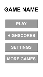
First, let’s look at an example main game screen.
This is functional but it could be much better. I get why developers do this – it’s easy & flexible. A developer can create a single button asset with a dynamic textbox and dynamically place the buttons. The number of buttons can easily grow and updating copy for changes and localization is easy.
It can be more than just ease of development too. Sometimes UI designers come from web or app design backgrounds or a game studio leans on their website designers for UI design. However, the rules for good game UI are very different than web/app UI. The core concept that differs is that web/app interface does not seek to suggest what users should do, game UI should do this blatantly.
To make better UI, ask the question, “What do you want players to do?”
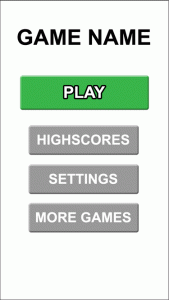
Do you want players to hit HIGH SCORES just as much as you want them to hit PLAY? No, of course not. Once you have your answer, you have an idea of what element should have dominance. The best thing to change is the size of the desired action input. This will work regardless of language, icons clarity, or color blindness. The larger size also draws players’ attention best. You could also change the color or shape.
There are numerous ways other to improve this. You can add icons for people who cannot read (i.e. kids) or non-english speakers to clearly delineate the “neutral” buttons.
This isn’t too much more work. Instead of one dynamic text button, you make two – a neutral button and a call-to-action button. On screens with no clear call to action, using all neutral buttons is acceptable. You can expand this concepts with a call-to-action button, a neutral button, and a “back” button, when you have numerous screens that flow back and forth.
Now let’s look at UI issues on the “Level End” and “Pause” screens. I am lumping these together because they usually have the same issues.
Level End or Pause screens
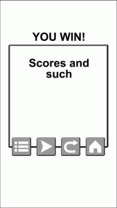
Here is what I see too often. Again, this is a fake example.
Again, a call-to-action is needed – what do want players to do?
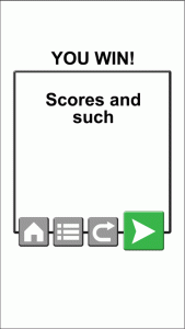
If you are too pressed for time to make two buttons instead of one, at least arrange buttons “in order of call-to-action”, in this case, home, level menu, restart, play/continue.
Conclusion
Find what you want your players to do and make that the dominant interactive element! Making 2 buttons is not that much harder than making one and the clarity it provides players is worth it.


